
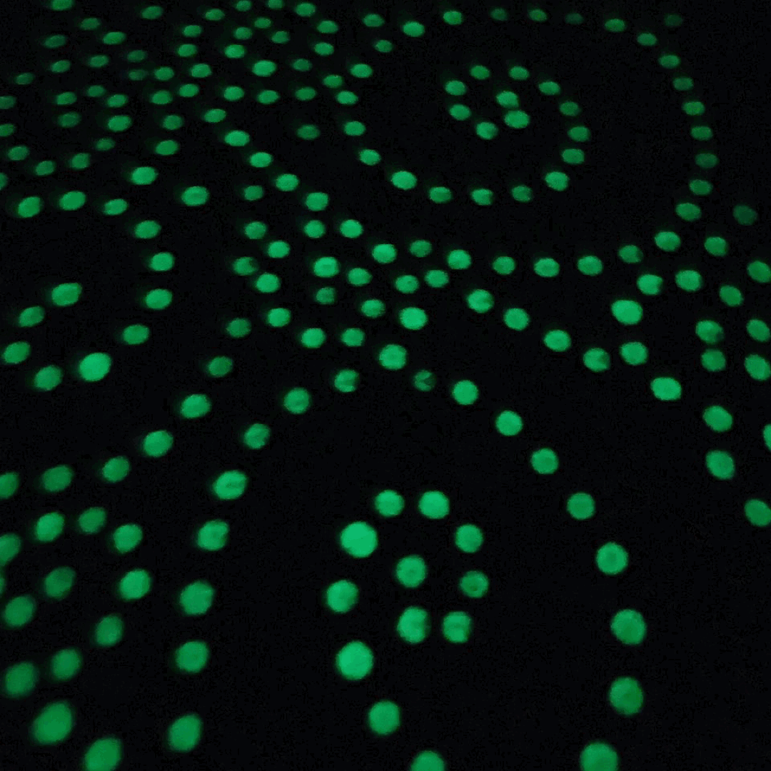
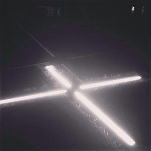
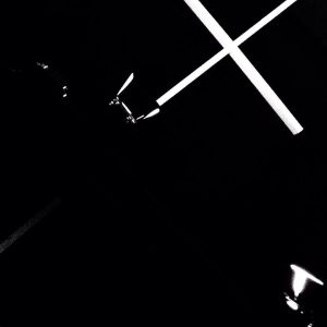
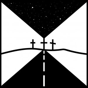
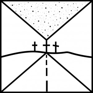
PHOSPHORUS
The phosphor technique is simply a continuation and intensification of the theme of light and darkness. It involves a certain level of interactivity, where the viewer can engage by illuminating the phosphor surfaces with light—for example, using a smartphone flashlight to ‘draw with light’. I use phosphor to depict geometric shapes, but I have also experimented with a different, more fluid technique of pouring phosphor paints. However, with this method, not all colors glow intensely enough, though perhaps they would with longer exposure to light… I still plan to develop this technique further. I stick to contrast so that the white elements stand out against the black background even in broad daylight… I started using phosphor in the summer of 2015, both in painting and on cotton tote bags. instagram
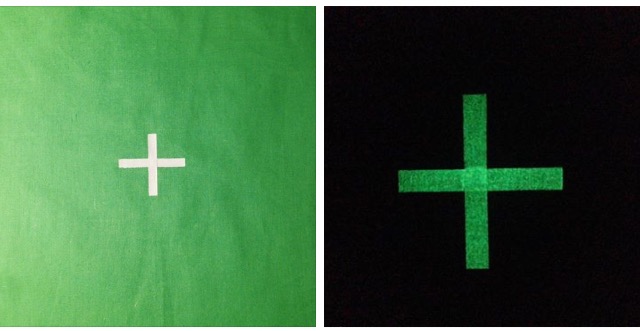
GREEN SCREEN
The green screen theme inspired me last year; at that time, the singer St. Vincent was promoting her new album and the music video for ‘New York’, which was recorded using a green screen. Around the same time, a Czech band was also shooting a video using a green screen, which inspired me to combine the green screen theme with my own idea. At the beginning of December 2017, I created a few green bags and a canvas with a glowing green screen theme.
CONTRAST
Contrast is quite significant in my work… I use it to distinguish between the surfaces of paintings, colors, motifs, and techniques, aiming to emphasize a certain sense of boundary. I apply geometric elements inspired by graphic art… The pieces are predominantly painted with acrylic and spray paint, which naturally leads me toward graphics and printmaking..

MONOCHROMY
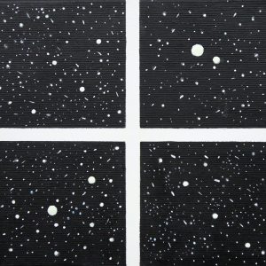
Often when working with the color black, I feel that I can’t go wrong with it. I like dark, black-and-white photography… including shots taken from space, sunrises, sunsets, moons, autumn, dark, bleak, black-and-white photography, autumn rain, fog; a subtle, light gray-and-white minimalism, white and black sand dunes…
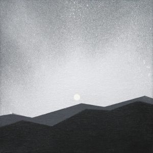

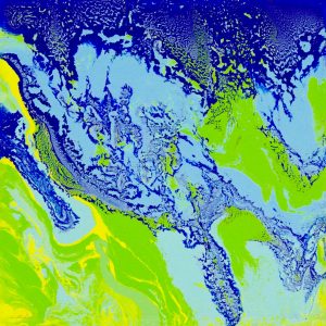
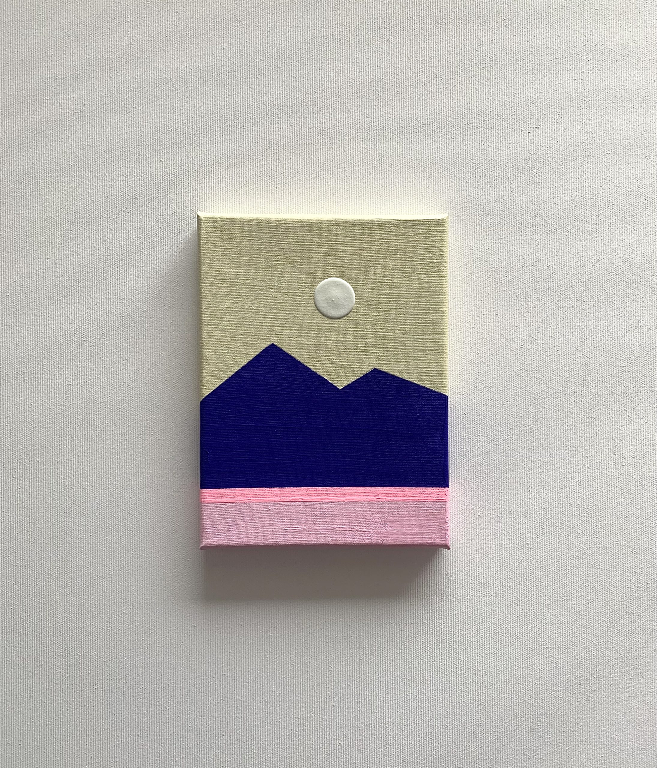
LANDSCAPE
The technique of pouring paint with water is more of a meditative game directly during the process… it is about mixing and pouring colors on the canvas, where it is important to choose the ‘right colors’ to express the atmosphere. Sometimes I manage to express multiple meanings through this technique: they are either micro-macro views of planet Earth, space, or elements of abstraction in nature—lava, a river, the sea, land, the weather.
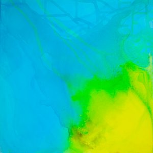
NATURE
I also engage in a more classical painting technique using brushstrokes. Color abstraction, nature themes.

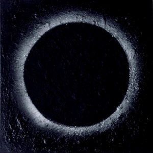
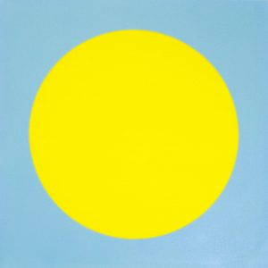
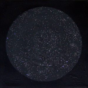
PLANETS
It is more about emphasizing the meaning of the circle—also as a planet, perfection, simplicity of form… where color and surface communicate. The texture highlights the surfaces of moons and planets; with color, I sometimes try to approach a realistic depiction, but lately, I enjoy combining brighter colors that no longer relate to the actual colors of planets. In this, I delve into creating through a graphic, abstract perspective, observing the relationship and combination of colors according to my own feeling and taste. My goal—precisely through the simplicity of shapes and the choice of two or three colors—is to pause, simplify, unburden, and cheer the mind. I express a certain attitude of minimalism and, at the same time, dominance (of colors and shapes).
GLITTER
Glitter is a specific theme of mine; I have been using it in my work for quite a long time. In the past, during my ‘handmade’ period, I generally liked it when things shimmered and sparkled, within the bounds of my taste. There is a certain kitschiness to the shimmer, but sometimes it can turn into something quite bearable… I most frequently use glitter in dark, dark-gray, rough geometric areas of the painting.


GOLD, SILVER, RAINBOW
I have always loved silver and gold; I’ve been wearing them in fashion accessories and footwear for many years. In painting, I also started using them, especially in spray paints. As I reflected on this, I was captivated by an article from NASA about the use of gold in space. It is used in construction of telescope mirrors to reflect and capture light and heat. NASA gold has excellent insulating properties and is reportedly used to maintain specific temperatures inside rockets… NASA-made gold is even used to coat Oscar statuettes, giving them lifelong durability… The rainbow-like, colorful harmony of shades stems from joy and capturing atmospheric changes in nature. The rainbow and gold also carry a biblical dimension within the texts of the Old and New Testaments.


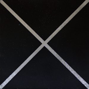
CROSS, X (the letter X)
For me, the cross carries a Christian meaning that expresses faith. I use it cautiously in my work. To emphasize this symbolism (of Light), I started using phosphor. The ‘X’ in my work can also represent a more abstract concept, such as a stop sign, a restriction, or a milestone.
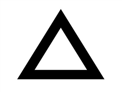
TRIANGLES


Since I use various geometric shapes in my painting, I was curious about what is written on the internet regarding their meaning, so I selected a few concepts that I can relate to, at least to some extent…
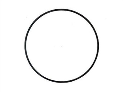
CIRCLE – is considered a perfect shape, symbolizing the origin of life; it has no beginning and no end, symbolizing eternity, infinity, God, and unity.
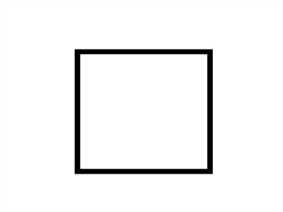
SQUARE – represents immutable perfection, stability, materiality, and earthliness. If placed on one of its vertices, it denotes the adaptability of the spirit to matter.
TRIANGLE – Shows direction, symbolizes strength. Another meaning is its symbolism of the Holy Trinity and divine unity in Christianity.
MINIMALISM/GEOMETRY


 No products in the cart.